
Fitts Law Explained How Distance and Size Shape Interface Design
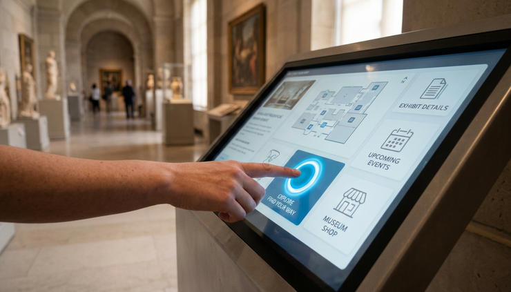
That friction is what Fitts' Law helps explain. At its core, the law says people can point to large, nearby targets faster than small, distant ones. It sounds obvious, but that simple idea shapes almost every tap, click, drag, swipe, and selection in interface design.
Good interfaces respect the body. They account for fingers, thumbs, mice, trackpads, styluses, attention, fatigue, and error. Fitts’ Law gives designers a practical way to think about all of that without guessing.
What Fitts’ Law actually says
Fitts’ Law comes from human motor behavior research. Psychologist Paul Fitts studied how long it takes a person to move to a target. The core finding was clear: movement time depends on two things.
Distance
How far the pointer, finger, or hand must travel.
Target size
How large the target is along the direction of movement.
The common form looks like this:
`MT = a + b log2(D / W + 1)`
Where:
Term | Meaning |
`MT` | Movement time |
`D` | Distance to the target |
`W` | Width of the target |
`a` and `b` | Constants based on the input method and context |
In plain English, the farther away a target is, the longer it takes to reach. The smaller the target is, the more the person has to slow down to hit it accurately.
This is why tiny close icons, narrow slider handles, small text links, and cramped mobile controls often feel frustrating. They demand precision. Precision takes time. It also increases the chance of error.
The law does not say every control should be huge. It does not replace visual hierarchy, content strategy, accessibility, or common sense. It gives one useful lens: make frequent, important actions easier to hit.
The speed and accuracy tradeoff
The law also reveals a tradeoff people make constantly. Fast movement reduces accuracy. Careful movement improves accuracy but takes more time.
Think about tapping a large “Play” button in a music app. The thumb can move quickly and land with little effort. Now think about tapping a small “x” next to a file name in a dense list. The hand slows down. The eye checks position. The person may hesitate because the cost of a wrong tap is higher.
That hesitation is part of the interface experience. It is not just visual. It is physical.
Good design reduces unnecessary precision. The person should not have to aim like a surgeon to complete a routine task.
Why the formula matters less than the behavior
Most interface designers do not need to calculate movement time with exact values. The deeper value is the mental model.
Fitts' Law teaches three practical lessons:
Put common actions close to where attention already is.
Make important targets large enough to hit without strain.
Use edges and corners because they behave like larger targets.
Those ideas apply to mobile apps, websites, software tools, kiosks, games, vehicle displays, remote controls, and any interface where people point at something.
Distance shapes how fast an interface feels
Distance is not just measured in pixels. In interface design, distance also means effort.
A button can be physically close on the screen but hard to reach with a thumb. A menu item can be visible but far from the current focus. A link can be nearby in a layout but separated from the content that explains it.
Designers need to think about distance in several ways.
Pointer distance
On desktop screens, users often move a mouse or trackpad pointer from one target to another. The more distance between related actions, the slower the task feels.
A simple example is a modal dialog. If the message appears in the center of the screen but the confirmation button sits far below the message, the user has to read, search, travel, and click. Keeping the main action close to the decision text reduces that travel.
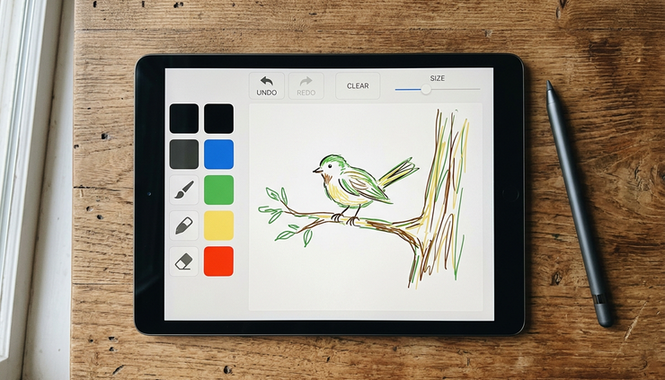
The same applies to toolbars. If a drawing tool places the canvas on one side and essential controls far away on the other, users spend more time moving across the screen. That may not matter for rare settings. It matters a lot for repeated actions like selecting a brush, changing size, or undoing a mistake.
Distance compounds. One long movement may feel minor. Repeating that movement hundreds of times becomes tiring.
Thumb distance
Mobile design adds a different problem. The screen may be small, but not every area is equally reachable.
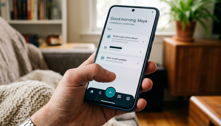
Many people hold a phone in one hand and use a thumb. The center and lower portions of the screen are usually easier to reach than the far top corners. Controls placed at the top of a tall phone can feel distant even if they are only a few inches away.
This is why bottom navigation often works well for primary mobile actions. It places frequent destinations near the resting position of the thumb.
Common thumb-friendly patterns include:
Bottom navigation bars for main sections
Floating action buttons placed within easy reach
Sticky bottom action areas for primary tasks
Swipe gestures for repeated navigation
Larger tap areas for controls near screen edges
This does not mean every control belongs at the bottom. Search, filters, titles, and overflow menus may still appear higher on the screen. The key is to reserve the easiest zones for actions people use most often.
Cognitive distance
There is another kind of distance that is easy to miss: the distance between understanding and action.
If a user reads a product description and the “Add to Cart” button is far away, the connection weakens. If an error message explains a problem but the fix is hidden elsewhere, the interface creates unnecessary work.
Physical distance and mental distance often overlap. Related information and related actions should usually live near each other.
For example:
Situation | Better placement |
Error message for a form field | Next to the field that needs attention |
Checkout total | Near the payment button |
Search filters | Close to the results they change |
Media controls | Near the media content |
Destructive confirmation | Close to the warning text |
When the next action appears near the reason for that action, the interface feels clearer and faster.
Size changes confidence as much as speed
Target size affects more than movement time. It changes how confident people feel.
Large targets invite action. Tiny targets create tension. The person has to aim, check, and sometimes correct. That small moment of uncertainty can make an interface feel fragile.
This is especially true on touchscreens, where the finger hides part of the target. Unlike a mouse pointer, a fingertip is wide and imprecise. People rarely tap with perfect accuracy. They tap within a rough area.
Visual size and hit area are not always the same
A target has two sizes:
The size people see
The interactive area that responds to input
Good interfaces often make the interactive area larger than the visible object. A small icon can have comfortable padding around it. The user sees a neat icon, but the finger gets a forgiving hit area.
This is common in mobile bars, media controls, checkboxes, and list rows. A checkbox may look small, but the whole label row can be tappable. That one choice can prevent a lot of missed taps.
Designers should not make people hit only the visible pixels of an icon if the surrounding space clearly belongs to the same control.
Tiny controls send the wrong message
Small controls can suggest that an action is minor, risky, or secondary. Sometimes that is useful. A destructive delete action should not always be the largest element on the screen.
Yet size should match importance and frequency. If people use a control often, it should not be tiny. If an action completes the main task, it should not be hidden in a small text link.
Consider these examples:
Weak target | Better target |
A tiny “Next” link after a form | A clear button aligned with the form flow |
A small checkbox with no tappable label | A checkbox row where both box and label respond |
A narrow slider thumb | A larger handle or step controls |
A small close icon at the top edge | A larger hit area around the close icon |
A text-only “Save” action in a crowded header | A clear button with enough padding |
The goal is not to make the screen loud. The goal is to make the right actions feel reachable.
Size matters more when the cost of error is high
A small target becomes worse when a mistake has consequences.
Missing a play button is annoying. Missing a “delete” control and hitting the wrong item can be stressful. Accidentally pressing “Submit” before reviewing a form can break trust.
For high-risk actions, designers should use a mix of size, spacing, labels, and confirmation. The target should be clear, but the layout should also prevent accidental activation.
That means:
Give destructive actions enough separation from safe actions.
Avoid placing opposite actions too close together.
Use clear labels instead of relying only on icons.
Add confirmation when the result is hard to undo.
Make the safe next step easier to find than the risky one.
Fitts’ Law is about speed and accuracy, but interface design also deals with judgment. A large target can speed up action. Sometimes the better choice is to slow the person down on purpose.
Edges, corners, and spacing can make targets easier
Some of the most useful lessons from Fitts’ Law appear at the edges of the screen.
A screen edge acts like a physical boundary. With a mouse pointer, the user can throw the pointer toward an edge and it stops there. That makes edge targets easier to hit than similarly sized targets floating in the middle of the screen.
Corners are even stronger because they stop movement in two directions. This is one reason operating systems often place important controls, menus, or system actions near screen edges and corners.
Edge targets can behave larger than they look
If a button touches the edge of the screen, the effective target can be larger in the direction of the edge. The pointer cannot overshoot past the screen boundary, so the edge helps capture the movement.
This is useful for:
Menu bars anchored to the top edge
Scrollbars at the side edge
Bottom navigation on mobile
Full-width buttons at the bottom of a panel
Playback controls along the bottom of video
On touchscreens, edges are more complex because system gestures may also live there. A control too close to the edge can conflict with back gestures, home gestures, or notification areas. The principle still helps, but it must be balanced with platform rules.
Spacing prevents the wrong target from winning
Size is not enough. Targets also need room around them.
If two buttons sit too close together, a larger target may still produce errors because the neighboring action competes with it. This is common in cramped toolbars, small pagination links, dense tables, and mobile forms.
Spacing works like a safety buffer. It reduces accidental taps and helps people see what belongs together.
Good spacing supports three things:
Accuracy
People can hit the intended target without fine control.
Grouping
Related controls feel connected, while separate actions feel separate.
Hierarchy
The primary action stands apart from secondary options.
Padding inside a button and space around a button both matter. Padding increases the hit area. External spacing protects the control from its neighbors.
Corners can help or hurt
Corners are powerful, but they should not become hiding places. A corner control that no one notices is not useful.
The top right corner, for example, often holds close buttons, settings, or overflow menus. Many users understand that pattern. But if the main action of a screen appears as a tiny icon in a top corner, the interface may feel harder than necessary.
Corners work best for stable, expected controls. They work poorly when designers use them to hide important decisions.
How Fitts’ Law works in real interface patterns
The law becomes more useful when applied to familiar patterns. It explains why some designs feel smooth and why others feel fussy.
Buttons should match task importance
A primary button usually deserves more size and weight than secondary actions. This helps visually, but it also helps physically. The main path becomes easier to select.
For example, a checkout screen might use a large “Place Order” button and smaller secondary links for editing the cart or returning to shopping. That size difference guides attention and reduces effort.
Still, designers need restraint. A huge primary button on every screen can create noise. Size should reflect the action’s role at that moment.
A useful rule is simple: the action people are most likely to take next should be one of the easiest targets to hit.
Forms should reduce pointer travel
Forms can become exhausting when labels, fields, help text, and buttons scatter across the page.
A good form keeps related pieces close:
Label near the field
Help text near the input
Error message near the problem
Primary action near the final input
Back or cancel action separated from submit
This reduces both movement and confusion. The user progresses through the form without hunting across the screen.
On mobile, placing the submit button after the final field often works well. In long forms, a sticky bottom button can help, but only if it does not cover content or create pressure before the user is ready.
Menus should account for direction
Menu design depends heavily on distance and target size.
A vertical menu with generous row height is easier to scan and select than a cramped menu with tiny text. A submenu that opens far away or requires a narrow diagonal movement can be frustrating because the pointer may slip away before the user reaches it.
Good menus create wide paths. They let the pointer move naturally from parent item to child item. They also keep common items in predictable positions.
For touch menus, row height matters even more. A menu item should feel like a full row, not a small word floating inside a row.
Icons need forgiving hit areas
Icons are compact, which makes them useful. They are also easy to make too small.
A common mistake is treating the icon graphic as the full target. For example, a trash can icon may be only a small shape, but the tappable area should include the padding around it.
Icon-only controls also need clear meaning. A large mystery icon is still a mystery. When space allows, labels reduce hesitation. When labels do not fit, use common icons, tooltips on desktop, and consistent placement.
Sliders and drag handles need extra care
Dragging is harder than tapping. It requires selecting a target, holding contact, moving accurately, and releasing at the right time.
Small slider handles may look elegant, but they can be hard to grab. This is especially true for volume, brightness, trimming, map pins, and timeline controls.
Designers can improve these controls by:
Enlarging the handle hit area
Letting users tap the track to jump
Providing plus and minus buttons for precision
Showing values clearly while dragging
Avoiding tiny handles for high-stakes settings
When precision matters, a drag control alone may not be enough. A numeric input or stepper can give the user a safer option.
Games and immersive interfaces show the law clearly
Games often reveal motor behavior faster than standard apps. If a control is too small or too far away, players feel it immediately.
Large touch zones, edge gestures, radial menus, and predictable button placement help players act quickly. Fast-paced interfaces must reduce aiming effort because attention is already loaded with movement, timing, and feedback.
The same idea applies to camera interfaces, music apps, cooking timers, fitness screens, and navigation systems. When attention is divided, controls need to be easier, not harder.
Where designers misuse Fitts’ Law
A useful law can become a blunt rule if applied without context. Size and distance matter, but they are not the whole interface.
Making everything large removes hierarchy
If every target is big, nothing feels important. The screen becomes heavy and slow to scan.
Designers need contrast. Primary actions can be large. Secondary actions can be smaller but still usable. Rare settings can sit deeper in the interface, as long as they remain findable when needed.
Hierarchy is not only visual decoration. It tells people what to do next.
Moving actions closer can create danger
A close target is faster to hit. That can be bad when the target is destructive or easy to trigger by accident.
For example, placing “Delete account” directly beside “Save changes” would reduce distance, but it would also increase risk. A safer design separates them, changes the visual style, and may require confirmation.
Fast access is best for frequent, safe actions. Risky actions need clarity and protection.
Bigger targets do not fix unclear language
A large button with vague text still causes hesitation.
Compare these labels:
Vague | Clear |
Continue | Review order |
Submit | Send application |
OK | Delete file |
Proceed | Choose delivery time |
Clear labels reduce mental effort. Fitts’ Law explains movement effort, but language shapes decision effort. Strong interfaces handle both.
The best target depends on input method
A mouse, finger, stylus, remote, keyboard, and game controller all behave differently.
Mouse pointers can hit smaller targets than fingers. A TV remote moves focus one step at a time, so distance works differently. Keyboard users may rely on tab order, shortcuts, and visible focus states. Voice input has its own needs.
Designers should not assume one input model. A control that works well with a mouse may fail on touch. A touch-friendly layout may still need strong keyboard support.
Inclusive design starts by asking how people will actually interact with the interface.

A practical checklist for better targets
Fitts’ Law becomes most useful when it changes design decisions. Before shipping an interface, review the main paths with a simple target checklist.
Check the most common actions first
Start with the actions people repeat most often.
Ask:
Is the main action easy to find?
Is it close to the content that supports the decision?
Is it large enough for the input method?
Is it easier to hit than less important actions?
Does its placement match user expectations?
Frequent actions deserve the most comfortable placement.
Check small and risky controls
Look for controls that demand precision.
Common trouble spots include:
Close icons
Expand and collapse arrows
Pagination numbers
Tiny checkboxes
Slider handles
Map pins
Calendar dates
Table row actions
Inline edit icons
These are often small because the layout is dense. If they matter, give them more space, a larger hit area, or an alternate path.
Check spacing between competing actions
Look at actions that sit near each other. The closer they are, the more likely mistakes become.
Pay special attention to pairs like:
Save and cancel
Submit and back
Delete and edit
Accept and decline
Buy and remove
Send and discard
When actions have very different consequences, they should not look or feel interchangeable.
Check edge and corner behavior
Screen edges can help, but they can also conflict with system gestures or browser controls.
Review:
Top bars on mobile browsers
Bottom controls near home indicators
Side gestures on Android and iOS
Dropdowns near screen boundaries
Full-screen media controls
Sticky buttons that cover content
A control can be mathematically easy to reach and still behave poorly if the system intercepts the action.
Test with real movement
Static review is useful, but movement reveals more.
Try completing key tasks with:
One hand on a phone
A trackpad instead of a mouse
Keyboard navigation only
A larger screen size
A smaller screen size
Increased text size
A slightly distracted state
Watch for pauses, missed taps, pointer corrections, and repeated travel across the screen. Those moments show where size and distance are creating friction.
You do not need a lab for every decision. Even a quick hands-on pass can expose targets that looked fine in a design file but feel wrong in use.
The takeaway for interface design
Fitts’ Law explains a simple truth with wide effects: people act faster and more accurately when targets are large enough and close enough. Distance adds effort. Small size demands precision. Edges, corners, spacing, and input method all change how easy a control feels.
The best interfaces use this principle quietly. They make common actions comfortable, place controls near the moment of decision, give fingers and pointers enough room, and protect users from costly mistakes.
A good next step is to pick one important flow in an interface and trace every tap or click. Look for long reaches, tiny targets, cramped neighbors, and risky actions placed too close together. Fixing even a few of those moments can make the whole experience feel faster, calmer, and more reliable.
Comments